
This post is asking if LiveView is able to remove Alpine, the “A” in PETAL. If you want to deploy your LiveView app right now, then check out how to get started. You could be up and running in minutes.
Recently, LiveView has matured greatly. A recent feature in v0.18, covered by Chris McCord in his ElixirConf 2022 keynote, is the addition to declarative assigns (think the old React/Vue props). This feature improves the developer experience when creating lots of small, reusable components.
The previous Phoenix.LiveView.JS feature added in v0.17, made it easier to execute JavaScript commands integrated with LiveView.
With all that LiveView goodness, can we drop Alpine.js from our default application stack? What happens when we pluck the “A” from PETAL? What are we left with? PETL? The real question is, can we accomplish everything we need?
What is PETAL?
Quick review here. The PETAL stack uses Alpine.js for client-side JavaScript interactions. Here’s a list of the different parts of PETAL:
The PETAL acronym was coined by Patrick Thompson and popularized on the Thinking Elixir Podcast back in Nov 2020 and a series of articles.
Are we ready to drop Alpine?
This is really a question of, “Can I do everything I need with just LiveView?”
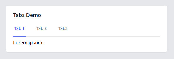
In my previous post, Making Tabs Mobile Friendly, I tried to do exactly that. Could I do something with front-end JavaScript behavior using only JS commands? For reference, the tab behavior looks like this:

The end result? I got really far! I ended up using a little JavaScript to bring it across the finish line.
From our recent Phoenix Files posts, I think we’ve demonstrated that, in most cases, we can provide a great user experience using just LiveView.
However, there was one aspect that I could not cleanly solve and that’s the problem we’ll explore here.
The Problem: Duplicated Logic
The compromise made was to duplicate some logic in two places.
- JS command logic is executed when clicking/changing the tab selection.
- Same logic is duplicated for the initial rendering of the component.
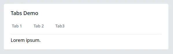
The component would be more streamlined if the initial render styled everything as “unselected”. For the tabs example, an un-styled initial render would look like this:
Then, immediately after rendering in the DOM, it would execute the JS commands to activate and style the selected tab. That means we would have only one implementation of “How do I make this look active?”
Unfortunately, that approach isn’t quite available yet.
Illustrating the Problem
In an effort to keep people from getting dizzy and falling out of chairs, I turned the following block of code into a screenshot. The code itself isn’t as important as recognizing a pattern. First, let’s see the image then follow it up with discussion about what’s important.
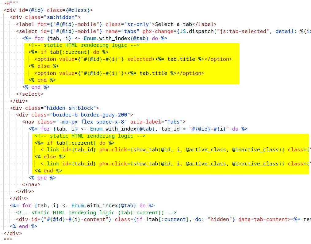
There are two highlighted blocks of HEEx code with sections that both use an if tab[:current] statement. Inside, the if/else statements are nearly identical lines of markup. This was the compromise made in Making Tabs Mobile Friendly that I didn’t like making.
These blocks of nearly duplicated lines of code only exist to handle the initial render. Separately, JS commands duplicate the logic to change the styles at runtime in response to user actions.
Let’s look at one example of the duplicated lines in greater detail. This markup sets the initial state for the select input displayed on mobile devices. The initial render is handled with this code.
<%= if tab[:current] do %>
  <option value={"#{@id}-#{i}"} selected><%= tab.title %></option>
<% else %>
  <option value={"#{@id}-#{i}"}><%= tab.title %></option>
<% end %>
What’s the difference between the two lines? If the option represents the “current” tab, then the selected attribute is included.
Here are the JS commands that perform the same logic when a user selects a different tab.
js
#... skipped
|> JS.remove_attribute("selected", to: "##{id}-mobile option")
|> JS.set_attribute({"selected", ""}, to: "##{id}-mobile option[value='#{tab_id}'")
Both blocks of code have the same effect but go about it differently. They manage the “selected” value on the option tag to match the “current” tab.
A similar situation exists for the tab display. It sets the colors for the current tab along with adding or removing an aria-current="page" attribute.
That’s two different ways of doing the same thing. The template version handles the initial render and the JS version is for when the user makes a change. The JS version is always required. It must be there to make it work at runtime in the browser.
Can we somehow avoid duplicating the logic for the initial render?
Mind the Gap
I tried to execute the JS commands in phx-mounted or with a hook using the mounted callback. What happens when we execute the JS commands using the phx-mounted callback?
In this animation, I’m repeatedly hitting the browser refresh. The phx-mounted callback doesn’t fire until after the websocket upgrade completes. The longer it takes for the websocket to connect (think longer distances), the more delayed the effect.
We are missing an earlier callback when the DOM is ready but before the websocket is mounted.
If we try adding an event listener to the browser’s DOMContentLoaded event and execute the code there, it works fine on an the initial load. However, when the component is dynamically displayed after the initial page load, then the event does not fire.
Hooking into the browser’s DOMContentLoaded event isn’t a general solution.
Possible Solutions?
We need a new callback. Not knowing what to call it, we’ll just refer to it as “domReady”. It would fire after the component is loaded to the DOM either on an initial page load or after being patched to the DOM via LiveView and morphdom.
Another option is for the existing mounted callback to be executed earlier. However, there are valid JS commands like JS.push that assumes a connected websocket is present.
Perhaps there are other possible solutions?
Time to Pluck the A from PETAL
LiveView + JS commands and the possible sprinkling of a hook here and there is great. We can do everything we need with LiveView!
Currently, that may mean our components duplicate some styling logic for the initial render. To improve that situation, and remove the compromise, a new callback earlier in the process that executes our JS commands is needed.
Even without an improved callback, we’ve seen that we can solve our front-end UI needs without bringing in extra front-end focused frameworks.
Yup. It’s time to pluck the “A” from PETAL.
That means we need a new acronym to describe our default stack! What should our new, further simplified stack be called?
Fly.io ❤️ Elixir
Need a place to deploy your Phoenix LiveView app? Fly.io is a great place to deploy your applications. You can be running in minutes.
Deploy your Phoenix app today! →