

Have you ever wanted a feature that lets your users select multiple items from a list, and performs some action on their selection? This is a really common thing to do, and it can be pretty involved to build. What do we do when we don’t want to write something over and over? We build a component!
Today we’ll walk through building a reusable Phoenix LiveView multi-select component. Then we’ll learn how to hook it up to let users filter a book collection by category. A single book can be both a “Romance” and a “Thriller” at the same time. We want to let users choose any combination of categories using the multi-select component we’re about to build.
Roadmap
We’ll define our component using the Phoenix.LiveComponent module, so it can manage its own state and events. We want this component to:
- Display a list of selectable options: To model the selectable options and keep track of the state, we’ll define a couple of
embedded_schemas. Then we’ll use the Phoenix.HTML.Form helpers to render the HTML inputs for selecting and deselecting the options; we’ll design the component to take a form as a parameter so that we can create the inputs as part of any external form. - Show the options we’ve already chosen: We’ll define a
selected_optionsassign to track and render the component’s selections. - Send selection updates to the parent LiveView: every time an option is selected, the multi-select component should inform the parent LiveView of any changes to the selection, so that it can perform any needed action with them. We’ll make this happen using the new feature that was introduced in LiveView v0.17.8: The ability to use
phx-changeto emit an event when an individual input has changed! - Update when the selection changes: We’ll take advantage of the LiveComponent life cycle. Once the parent assigns are updated to keep the updated selection, the updated assigns will propagate to the multi-select component so it will render its own changes.
- Show/hide the list of selectable options: We’ll use the
JS.togglecommand to hide and show the options list.
Once we finish our work, we’ll have this component ready to be used:
Let’s start!
Creating a LiveComponent
We start by defining a skeleton LiveComponent—which we name MultiSelectComponent—with placeholder render/1 and update/2 callbacks.
defmodule PhoenixFilesWeb.MultiSelectComponent do
  use PhoenixFilesWeb, :live_component

  alias PhoenixFiles.MultiSelect

  def render(assigns) do
    ~H"""
    <div>

    </div>
    """
  end

  def update(%{id: id} = params, socket) do
    {:ok, assign(socket, :id, id)}
  end
end
Our update/2 function is called after the mount/1 function on the parent LiveView, and again every time there is an update of the parent LiveView’s assigns.
Note that all of the component’s HTML content must be inside a containing <div>. Let’s start filling it in.
You may have noticed that we’re interpolating the component’s @id assign to define the ID of the selected options container. This is to ensure that this element (and other HTML elements we’ll define later) will have a unique ID in case more than one instance of our MultiSelectComponent is rendered.
def render(assigns) do
    ~H"""
    <div class="multiselect">
      <div class="fake_select_tag"
        id={"#{@id}-selected-options-container"
      >
        <div class="icon">
          <svg id={"#{@id}-down"}
            <path ... />
          </svg>
        </div>
      </div>
    </div>
    """
  end
We define a container to display the options, and simulate an HTML <select> tag with the help of a <div> and a chevron-down SVG icon:
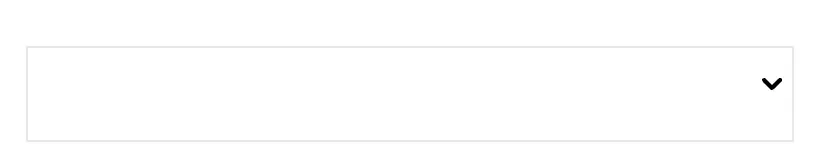
We’ll add some magic to this later. But first let’s get the component working!
Defining a data model
Each option in our list needs a label to display, and some way to keep track of whether it is selected or not.
defmodule PhoenixFiles.MultiSelect do
  use Ecto.Schema

  embedded_schema do
    embeds_many :options, PhoenixFiles.MultiSelect.SelectOption
  end

  defmodule SelectOption do
    use Ecto.Schema

    embedded_schema do
      field :selected, :boolean, default: false
      field :label, :string
    end
  end
end
This defines an embedded schema called MultiSelect ; its :options field embeds a list of SelectOption schemas. The SelectOption schema, in turn, defines the two fields we need for each option: :selected and :label.
Rendering the selectable options within a form
Our update/2 function adds :selectable_options (a list of SelectOption schemas) and a yet-to-be-defined enclosing :form to the component’s assigns.
def update(params, socket) do
%{options: options, form: form, id: id} = params
socket =
  socket
  |> assign(:id, id)
  |> assign(:selectable_options, options)
  |> assign(:form, form)

  {:ok, socket}
end
Then render/1 uses those assigns to put the pieces together in our template:
def render(assigns) do
  ~H"""
  <div class="multiselect">
    <div class="fake_select_tag"
      id={"#{@id}-selected-options-container"}
    >
      ...
    </div>
    <div id={"#{@id}-options-container"}>
      <%= inputs_for @form, :options, fn opt -> %>
        <div class="form-check">
          <div class="selectable-option">
            <%= checkbox opt, :selected,
              value: opt.data.selected
            %>
            <%= label opt, :label, opt.data.label %>
          </div>
        </div>
      <% end %>
    </div>
  </div>
  """
end
The main feature here is our inputs_for/4 function. It attaches our nested :options data to the form and iterates over the options, invoking the checkbox/3 and label/3 functions to render those elements for each option.
With this code, our component looks like this:
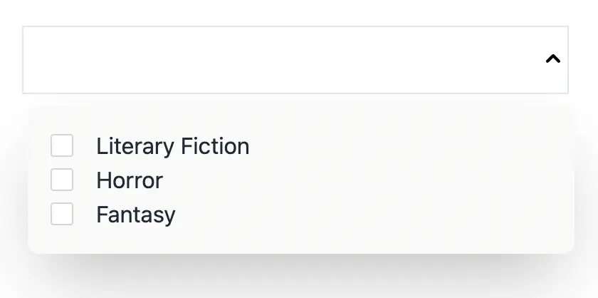
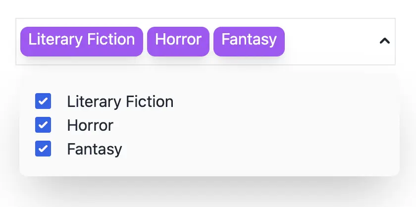
Displaying the set of selected options
Inside our select, we want to display a list of selected options, like this:
We write a private function filter_selected_options to find all the SelectOptions with selected == true , and update/2 adds these to our assigns:
def update(params, socket) do
  %{options: options, form: form, id: id} = params
  socket =
    socket
    |> assign(:id, id)
    |> assign(:selectable_options, options)
    |> assign(:form, form)
    |> assign(:selected_options, filter_selected_options(options))

  {:ok, socket}
end

defp filter_selected_options(options) do
  Enum.filter(options, fn opt ->
    opt.selected in [true, "true"]
  end)
end
Now we can iterate over @selected_options and display their labels in their own <div>s:
<div class="fake_select_tag"
  id={"#{@id}-selected-options-container"}
>
  <%= for option <- @selected_options do %>
    <div class="selected_option">
      <%= option.label %>
    </div>
  <% end %>
  <div class="icon">
    ...
  </div>
</div>
Sending selection updates
So far we can render selected options, but the checkboxes aren’t set up to change the selection.
We need to tell the server (and update our component) every time items have been selected or deselected, which means emitting an event.
Thanks to LiveView v0.17.8, we have the phx_change option available to emit events when there are changes to individual inputs in a form. For our example, we use this option on each of the checkboxes to emit the checked event. This tells us when a selection change was made.
<%= checkbox value, :selected,
  value: value.data.selected
  phx_change: "checked",
  phx_target: @myself
%>
Since our LiveComponent lives in the same process as the parent LiveView, we must specify that the checked event is handled by the MultiSelectComponent and not by the parent LiveView. To do this, we add the phx-target: @myself option to our form. The @myself here tells LiveView to route the event to our component.
Now let’s see how to handle the checked event:
#values = %{"2" => %{"selected" => "true"}}
def handle_event(
      "checked",
      %{"multi_select" => %{"options" => values}},
      socket
    ) do

  [{index, %{"selected" => selected?}}] = Map.to_list(values)
  index = String.to_integer(index)
  selectable_options = socket.assigns.selectable_options
  current_option = Enum.at(selectable_options, index)

  updated_options =
    List.replace_at(selectable_options,
      index,
      %{current_option | selected: selected?}
    )

  send(self(), {:updated_options, updated_options})

  {:noreply, socket}
end
There’s a lot going on in that code. Let’s go through it in more detail.
The event is emitted with a payload with the following structure:
%{"multi_select" =>
  %{"options" =>
    %{"2" => %{"selected" => "true"}}
  }
}
First we extract the checkbox index and the selected? value from that payload, with the following line:
#[{"2", %{"selected" => "true"}}]
[{index, %{"selected" => selected?}}] = Map.to_list(values)
We used the :selectable_options assign to store the options list in our component; now we have to update the checked option value inside that list. For that, we get the SelectOption found at the index we got earlier from the :selectable_options assign, and change the :selected value within the list of options.
index = String.to_integer(index)
selectable_options = socket.assigns.selectable_options
current_option = Enum.at(selectable_options, index)

updated_options =
  List.replace_at(selectable_options,
    index,
    %{current_option | selected: selected?}
  )
Then, we send the updated options to the parent LiveView, so it can decide what to do with them.
send(self(), {:updated_options, updated_options})
Showing and hiding the selectable options
Now that our component essentially works, we can add life to our simulated HTML <select> tag.
We add a chevron-up icon to match the chevron-down we already have, so that both icons have the same location. When the component loads, the #up- icon and the #options_container- element containing the whole list have class hidden, which is defined in our CSS (we use Tailwind) with the property display: none;.
A phx-click binding on each <svg> invokes JS.toggle to toggle visibility of both icons and the options list on click.
<div class="icon">
  <svg id={"#{@id}-down-icon"}
    phx-click={
      JS.toggle()
      |> JS.toggle(to: "##{@id}-up-icon")
      |> JS.toggle(to: "##{@id}-options-container")
    }>
    <path ... />
  </svg>
  <svg id={"#{@id}-up-icon" class="hidden"
    phx-click={
      JS.toggle()
      |> JS.toggle(to: "##{@id}-down-icon")
      |> JS.toggle(to: "##{@id}-options-container")
    }>
    <path .... />
  </svg>
</div>
Tada! Our render function is finished!
MultiSelectComponent in action
You’ll remember we were going to let users choose multiple categories to filter our books by. We saw the categories in our examples, but we haven’t shown where they come from yet. We need to plug our categories into MultiSelectComponent.
Here they come! We define the assigns we use in the parent LiveView:
def mount(_params, _session, socket) do
  categories =
    [
      %SelectOption{id: 1, label: "Fantasy", selected: false}
      %SelectOption{id: 2, label: "Horror", selected: true},
      %SelectOption{id: 3, label: "Literary Fiction", selected: false},
    ]

  {:ok, set_assigns(socket, categories)}
end
categories contains our category options in the shape of the SelectOption schema we defined earlier as part of MultiSelectComponent.
Our set_assigns/2 function sets three assigns we’ll need: :changeset, :books, and :categories:
defp set_assigns(socket, categories) do
  socket
  |> assign(:changeset, build_changeset(categories))
  |> assign(:books, filter_books(categories))
  |> assign(:categories, categories)
end
We’ve discussed :categories, and you can guess what :books and filter_books/2 are. What about :changeset?
LiveView provides the form function component to create HTML forms. This component receives an Ecto.Changeset to convert it to a form, and then, the resulting form is used to generate input fields.
We create a MultiSelect changeset with the build_changeset/1 function:
defp build_changeset(options) do
  %MultiSelect{}
  |> Ecto.Changeset.change()
  |> Ecto.Changeset.put_embed(:options, options)
end
Once the changeset is created, we can use it to create our form:
<.form let={f} for={@changeset} id="multiselect-form">
</.form>
An important detail here is that our form is accessible in the f variable. We need to pass this to our inputs so it all gets linked together inside our MultiSelectComponent. For that, we just render our MultiSelectComponent inside our form as follows:
<.form let={f} for={@changeset}  id="multiselect-form">
  <.live_component
    id="multi"
    module={MultiSelectComponent}
    options={@categories}
    form={f}
  />
</.form>
When a category is selected in the MultiSelectComponent, an update is sent to the parent LiveView. The parent LiveView needs to handle the event and update the books list:
def handle_info({:updated_options, options}, socket) do
  # update books list, the selected categories and the changeset
  {:noreply, set_assigns(socket, options)}
end
When the update is received, the parent assigns are updated and the update/2 function inside our MultiSelectComponent is called. This means both parent and multi-select component :categories/:selected_options are updated, and both the parent LiveView and the MultiSelectComponent now have the same information.
The parent LiveView is the source of truth; it keeps the selected categories and is responsible for updating the MultiSelectComponent assigns.
Fly.io ❤️ Elixir
Fly.io is a great way to run your Phoenix LiveView app close to your users. It’s really easy to get started. You can be running in minutes.
Deploy a Phoenix app today! →
Wow, we covered a lot! We built a highly responsive fancy filter feature, without writing any JavaScript!
Our component is great, but we can still improve it. Let’s think about the future: what would happen to the selected options if we lost the internet connection for a few seconds and the page was reloaded? What if, in addition to sending updates to the parent LiveView, we want to perform another action?
Bonus: Form recovery
What happens to the component if we lose the connection and then recover it?
Let’s try selecting some values, stopping the app and starting it again to see what happens:
The selected options are lost!
To avoid losing the selected options, we make use of form recovery after reconnections. We mark our form with the phx-change binding, so that the validate event is triggered to the server with the selected values right after the connection is re-established.
<.form
  let={f}
  for={@changeset}
  id="multiselect-form"
  phx-change="validate"
>
  ...
</.form>
Now we have to set all our assigns inside the handle_event callback:
#multi_form = %{ "options" =>
#  %{
#    "0" =>
#      %{"id" => "1", "label" => "Fantasy", "selected" => "true"},
#    "1" =>
#      %{"id" => "2", "label" => "Horror", "selected" => "true"},
#    "2" =>
#      %{"id" => "3", "label" => "Liter...", "selected" => "true"}
#   }
#}
def handle_event(
      "validate",
      %{"multi_select" => multi_form},
      socket
    ) do
  options = build_options(multi_form["options"])

  {:noreply, set_assigns(socket, options)}
end
We receive all the values that had been selected and were saved thanks to our form. The build_options/1 function is just a helper to create a list of SelectOption with the form values.
defp build_options(options) do
    Enum.map(options, fn {_idx, data} ->
      %SelectOption{
        id: data["id"],
        label: data["label"],
        selected: data["selected"]
      }
    end)
  end
With these changes, we ensure that the form can recover the values after reconnecting:
Bonus 2: Customized behavior when options are selected.
Right now, every time an element is selected, we send the updates to the parent LiveView. However, we are creating a reusable component; wouldn’t it be better to be able to customize what action to take when there is a new selection?
To do this, we apply a little trick; we send a function in the component’s parameters to be executed when an element is selected.
<.live_component
  id="multi"
  module={MultiSelectComponent}
  options={@categories}
  form={f}
  selected={fn opts -> send(self(), {:updated_options, opts}) end}
/>
Then we keep the :selected function in the component assigns:
def update(params, socket) do
  %{options: options, form: form, id: id, selected: selected} = params
  socket =
    socket
    |> assign(:id, id)
    |> assign(:selectable_options, options)
    |> assign(:form, form)
    |> assign(:selected_options, filter_selected_options(options))
    |> assign(:selected, selected)

  {:ok, socket}
end
That way we can execute any function with an arity 1 when we handle the checked event:
def handle_event(
      "checked",
      %{"multi_select" => %{"options" => values}},
      socket
    ) do
  .
  .
  .
  socket.assigns.selected.(updated_options)

  {:noreply, socket}
end
Pretty slick! It lets the caller of the function decide what action to apply.
Wrap-Up
In our example we used the Phoenix.LiveComponent behavior to separate markup, state and events into a component that we can reuse as many times as needed. We designed a data model to keep the selectable options independent of any specific use case, we designed our component to be used as part of any custom Phoenix.Form, and we used a trick to execute a callback function each time an option is selected.
All these design decisions to create a solid base to reuse our component and customize it to fit our needs!
Where else would you use this multi-select component?
You can find this example here: bemesa21/phoenix_files