


The problem
We’d like a way to reuse code for UI components that are very similar in structure, but carry different content.
Imagine we’re writing a Phoenix LiveView app that frequently uses modals to display or save information. For a consistent experience, they might all have HTML elements for header, body, and footer regions. We’d prefer not to repeat this markup for all possible variations!
The solution
This is a job for LiveView’s function components (Phoenix.Component).
A function component is basically a wrapper for a ~H sigil that provides a template for customized content. It doesn’t have state of its own.
The ~H sigil lets us inject HEEx templating code into our source, to be interpreted and rendered into our LiveView. It’s used not only in defining a template for a component, but also in rendering it.
When we call the function component, we pass our unique content to it, either through its assigns parameter, or, if we need to pass whole blocks of HTML, using the slots mechanism. Or both.
Example: multi-part modals
Let’s go back to our modal example. We’ll lay some groundwork with a basic function component we’ll call modal, and morph it to demonstrate the following powers:
- displaying strings from an assigns map we pass to it
- displaying custom HTML we insert in its default slot
- placing multiple blocks of custom HTML through named slots
- dealing gracefully with slots that are not always defined
- passing values into the component through a named slot’s attributes
- passing a value from the component’s assigns map into one of its slots
Custom text using assigns
We call use Phoenix.Component at the top of our module to import the functions defined in Phoenix.LiveView and Phoenix.LiveView.Helpers. Then we can go ahead and define our function component.
defmodule MyAppWeb.UI do
  use Phoenix.Component

  def modal(assigns) do
    ~H"""
      <div class="modal-container">
        <div class="header">
          <h1><%= @title %></h1>
        </div>

        <div class="modal-body">
          <p class="text-sm text-gray-500">
            <%= @body %>
          </p>
        </div>

        <div class="modal-footer">
          <button>Ok</button>
          <button>Cancel</button>
        </div>
      </div>
    """
  end
end
This defines a function, called modal/1, that renders an HTML div element with class "modal-container", enclosing more divs for the three distinct parts of our modal: header, body, and footer.
Within the "header" div, <%= @title %> will substitute the value of the assign @title on render (we could equally well write it <%= assigns.title %>; it’s just longer). In the div with class "modal-body", <%= @body %> will give us the value of @body. The component will expect us to supply it with a map of assigns that include these, when we call it.
The “modal-footer” div contains two buttons, “Ok” and “Cancel,” that for the moment don’t do anything.
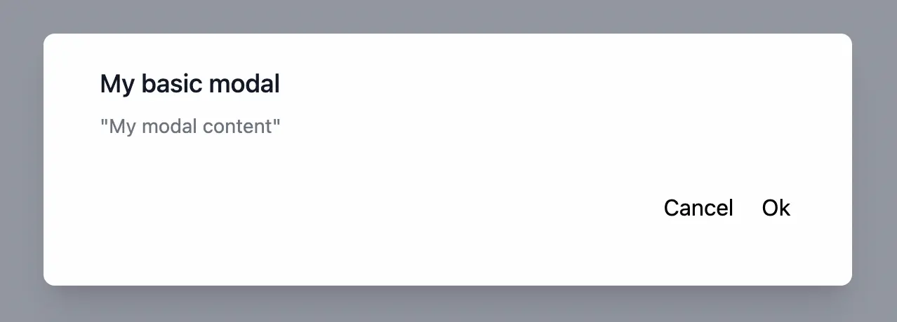
Now we can call .modal inside a sigil_H to render it, providing the @title and @body assigns in the opening tag:
alias MyAppWeb.UI
~H"""
<UI.modal
  title="My basic modal"
  body="My modal content">
</UI.modal>
"""
If we import the module into the view where we’ll render it, we don’t have to use the full module name:
import MyAppWeb.UI
~H"""
<.modal title="My basic modal" body="My modal content"></.modal>
"""
With some CSS magic, we’ll get a modal like this:
Custom HTML using slots
What if we want to put some custom HTML into the body of the modal? We can’t fit a block of HTML into an assign. That’s where slots come in.
When you include content inside a function component—that is, between its opening and closing tags—it gets assigned to the component’s default slot, @inner_block. This assign can be rendered in our component with a render_slot/2 macro in the template like this:
<%= render_slot(@inner_block) %>
You could even use other components within the slot. We’ll keep our demonstration simple: just a bit of custom HTML and some graphics.
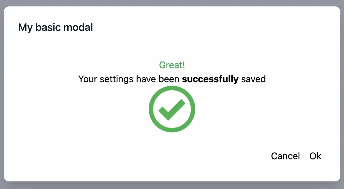
Let’s imagine that we want to display a modal to confirm that the user settings have been saved successfully. We tell the modal function to render the @inner_block in the "modal-body" div:
def modal(assigns) do
  ~H"""
  <div class="modal-container">
    <div class="header">
      <h1><%= @title %></h1>
    </div>

    <div class="modal-body">
      <p class="text-sm text-gray-500">
        <%= render_slot(@inner_block) %>.   <!-- HERE  -->
      </p>
    </div>

    <div class="modal-footer">
      <button>Ok</button>
      <button>Cancel</button>
    </div>
  </div>
  """
 end
And put our custom HTML content inside the call to modal like so:
~H"""
<.modal title="My basic modal">

  <!-- body content  -->
  <div class="text-center justify-center items-center">
    <h1 class="text-green-600">Great!</h1>
    <p>Your settings have been <strong>successfully</strong> saved</p>
    <div class="flex items-center justify-center">
      <img class="h-20 w-20 rounded-full flex items-center"
      src={Routes.static_path(@socket, "/images/check.webp")}
      alt="">
    </div>
  </div>
  <!-- body content  -->

</.modal>
"""
Our fancy custom message gets rendered in our modal.
Named slots
We’ve modified the body of the modal with @inner_block, but we might want custom markup in the header and footer too. But wait—if @inner_block is the default slot, that implies there can be others. It’s true! They need different names, so you can refer to them (a named slot can also take an argument, as we’ll see below).
Named slots are defined with the following syntax, when we call our function component:
<:name_of_my_slot>
  My slot content
</:name_of_my_slot>
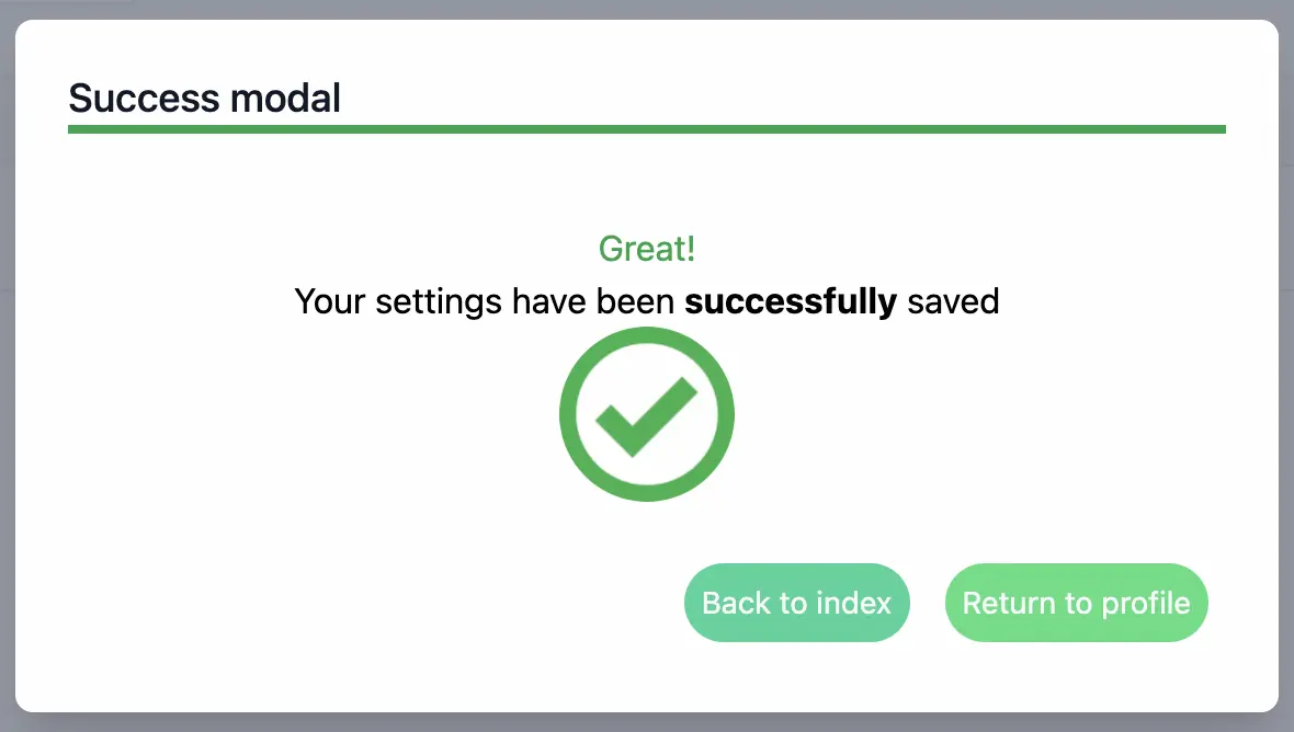
Let’s prep the template to customize the header and the buttons in the footer using slot assigns named @header , @confirm, and @cancel:
def modal(assigns) do
  ~H"""
  <div class="modal-container">
    <div class="header">
      <%= render_slot(@header) %>                 <!-- HERE  -->
    </div>

    <div class="modal-body">
      <p class="text-sm text-gray-500">
        <%= render_slot(@inner_block) %>          <!-- HERE  -->
      </p>
    </div>

    <div class="modal-footer">                    <!-- HERE  -->
      <button><%= render_slot(@confirm) %></button>
      <button><%= render_slot(@cancel) %></button>
    </div>
  </div>
  """
 end
And here’s how we specify the contents of those slots for this variant of the modal, along with the default slot we already filled:
~H"""
<.modal title="My basic modal">
  <!-- named slot: header  -->
  <:header>
    <div class="border-b-4 border-green-600">
      Success modal
    </div>
  </:header>

  <!-- inner_block slot  -->
  <div class="text-center justify-center items-center">
    <h1 class="text-green-600">Great!</h1>
    <p>Your settings have been <strong>successfully</strong> saved</p>
    <div class="flex items-center justify-center">
      <img class="h-20 w-20 rounded-full flex items-center justify-center"
      src={Routes.static_path(@socket, "/images/check.webp")}
      alt="">
    </div>
  </div>

  <!-- footer named slots  -->
  <:confirm>
    Return to profile
  </:confirm>

  <:cancel>
    Back to index
  </:cancel>

</.modal>
"""
Note that everything in the body of our function component that is not inside a named slot is inside the default slot @inner_block.
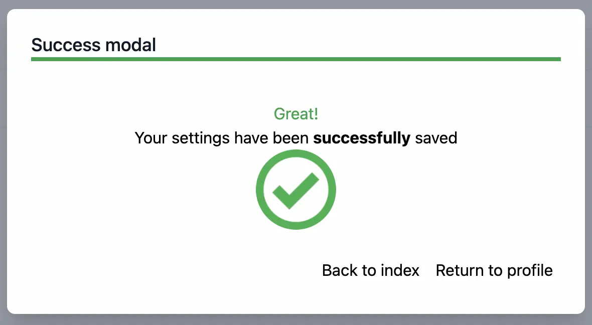
Great! The title, the body, and the button text have all been customized!
Optional slots
Some modals might not need all the slots we’ve told modal to render. Our function component will choke on any undefined assigns, so we start our definition by making sure @header, @confirm, or @cancel exist:
def modal(assigns) do
  assigns =
    assigns
    |> assign_new(:header, fn -> [] end)
    |> assign_new(:confirm, fn -> [] end)
    |> assign_new(:cancel, fn -> [] end)

  ~H"""
  <div class="modal-container">
    <div class="header">
      <%= render_slot(@header) %>
    </div>
    ...
Here, the assign_new/2 function initializes any of those that’s missing a value with an empty list.
Call modal without any of the named slots:
~H"""
<.modal title="My basic modal">

  <!-- this modal has no footer or header  -->

  <div class="text-center justify-center items-center">
    <h1 class="text-green-600">Great!</h1>
    <p>Your settings have been <strong>successfully</strong> saved</p>
    <div class="flex items-center justify-center">
      <img class="h-20 w-20 rounded-full flex items-center"
      src={Routes.static_path(@socket, "/images/check.webp")}
      alt="">
    </div>
  </div>

</.modal>
"""
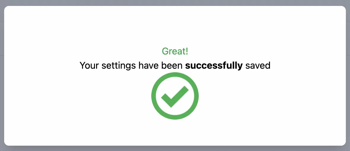
No problem! The unused slots are empty, but not error-raisingly undefined.
Slot attributes
We can give named slots attributes in much the same way that we pass assigns to regular function components, and these attributes can be accessed from inside the function component.
We’re going to use slot attributes to pass custom CSS classes to each of the footer buttons. Here we give the @confirm and @cancel slots each an attribute called classes:
<!-- named slot: confirm 1 -->
<:confirm classes="bg-green-400 rounded-full text-slate-50 text-sm p-2">
  Return to profile
</:confirm>

<!-- named slot: cancel 1 -->
<:cancel classes="bg-emerald-400 rounded-full text-slate-50 text-sm p-2">
  Back to index
</:cancel>
Now, to get at the attributes of our named slots, we have to take into account that it’s possible to define multiple entries for the same named slot. When we call render_slot/2, it simply renders all the entries for the slot name. But inside the slot’s assign, there’s a list of attribute maps: one for each entry. Even if there’s only one entry, and so one attributes map, we use a for loop to get into the list and access it.
To demonstrate: For every slot entry named @confirm, we’ll make a button whose class is the string-interpolated value of the classes attribute of that entry. We’ll do the same again for @cancel.
<!-- FOOTER -->
<div class="modal-footer">
  <%= for confirm <- @confirm do %>
    <button class={"#{confirm.classes}"}><%= render_slot(@confirm) %></button>
  <% end %>

  <%= for cancel <- @cancel do %>
    <button class={"#{cancel.classes}"}><%= render_slot(@cancel) %></button>
  <% end %>
</div>
Since there’s only one slot entry for each name, we’ll only get one button from each!
Our slot-specific classes have been applied, giving the buttons different colors!
Passing assign values to the caller’s slot
Sometimes we’ll want to use data from an assign passed to the function component, within content that’s provided by a slot. The component has to pass that value into the slot to be rendered. We can do this by giving it as an argument to render_slot/2.
Suppose our function component takes a @user assign with data about the current user in a struct. We want to display @user.name from that struct in the body of the modal.
In the function definition, we’ll pass render_slot/2 the @user.name as an argument.
<!-- MODAL BODY -->
<div class="mt-10">
  <p id={"#{@id}-content"} class="text-sm text-gray-500">
  <%= render_slot(@body, @user.name) %>
  </p>
</div>
In the following slot definition, the let argument binds the incoming @user.name data to the name username, so we can ask for it to be interpolated using <%= username %>. We have to use a named slot for the body this time, so we can use let.
<:body let={username}>
  <div class="text-center justify-center items-center">

    <h1 class="text-green-600">Hey, <%= username %>!</h1>

    <p>Your settings have been <strong>successfully</strong> saved</p>
    <div class="flex items-center justify-center">
      <img class="h-20 w-20 rounded-full flex items-center"
      src={ Routes.static_path(@socket, "/images/check.webp") }
      alt="">
    </div>
  </div>
</:body>
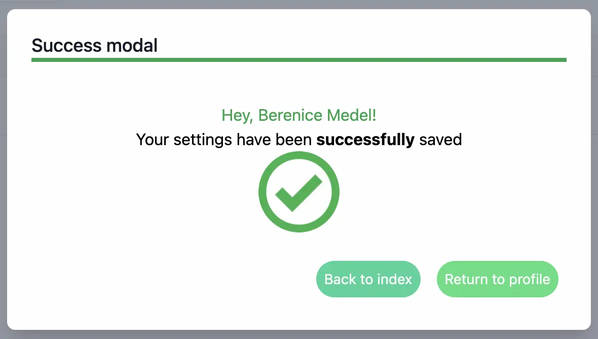
Our modal is now super-duper customized, with the current user’s name provided to a slot from an assign!
It’s your turn to build something with the power of LiveView function components!